Performance that looks as good as it rides

The project
The approach
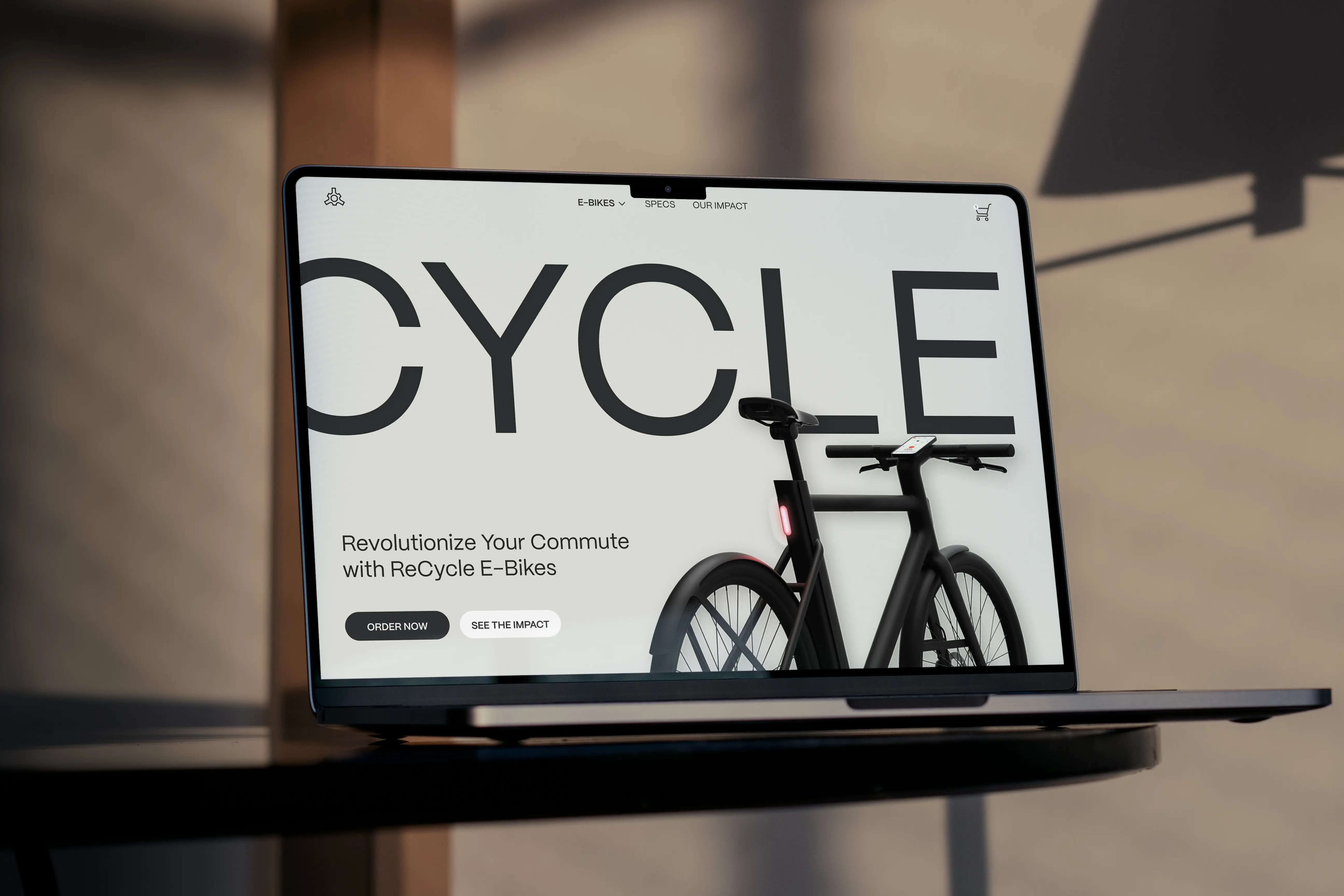
Re-cycle is a speculative e-com e-bike platform that speaks to two audiences at once: commuters who want a reliable daily ride and enthusiasts who care about design and performance. The brand voice is premium and assured, with copy that stays clear and concise. Photography and video carry the story of movement and materials. Pages feel calm and modern so the bikes stand out and the details feel credible.
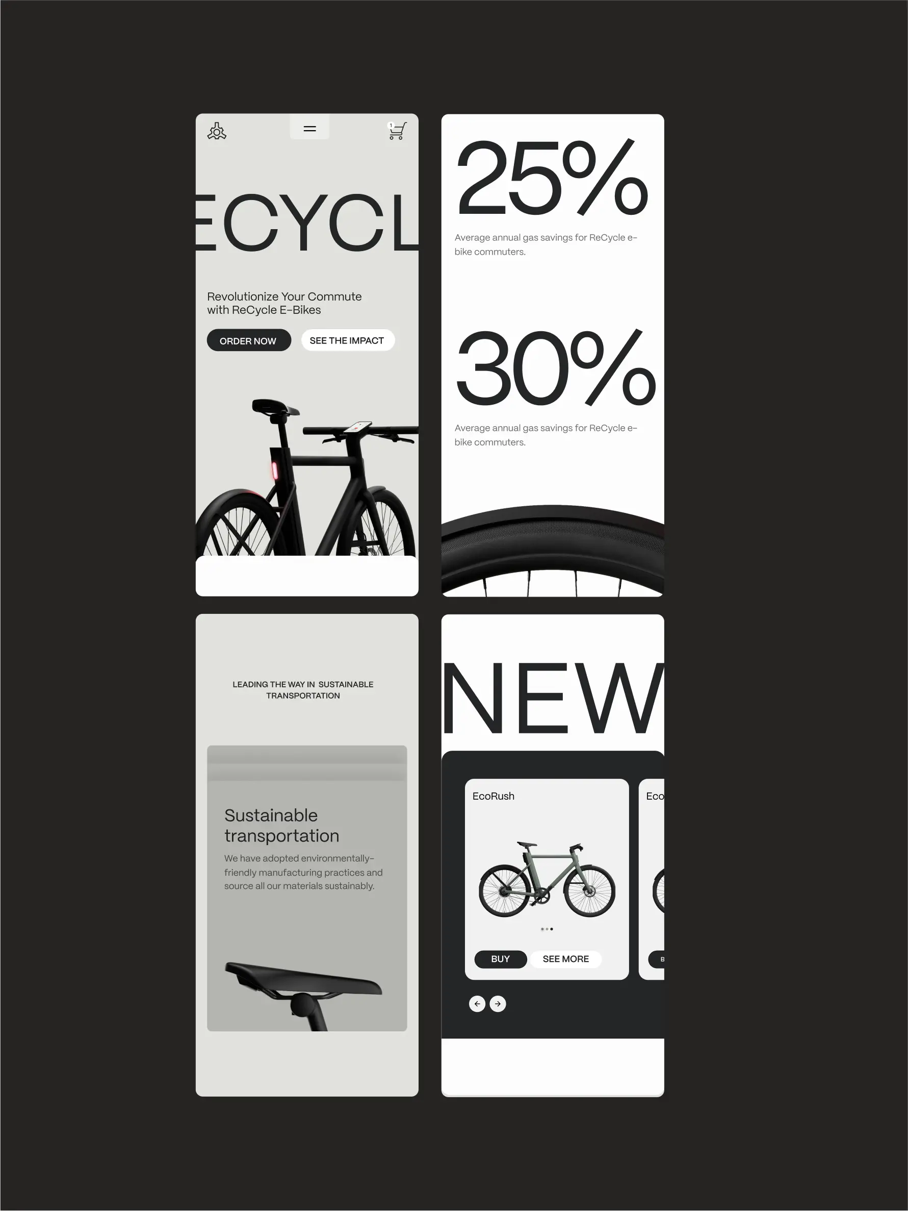
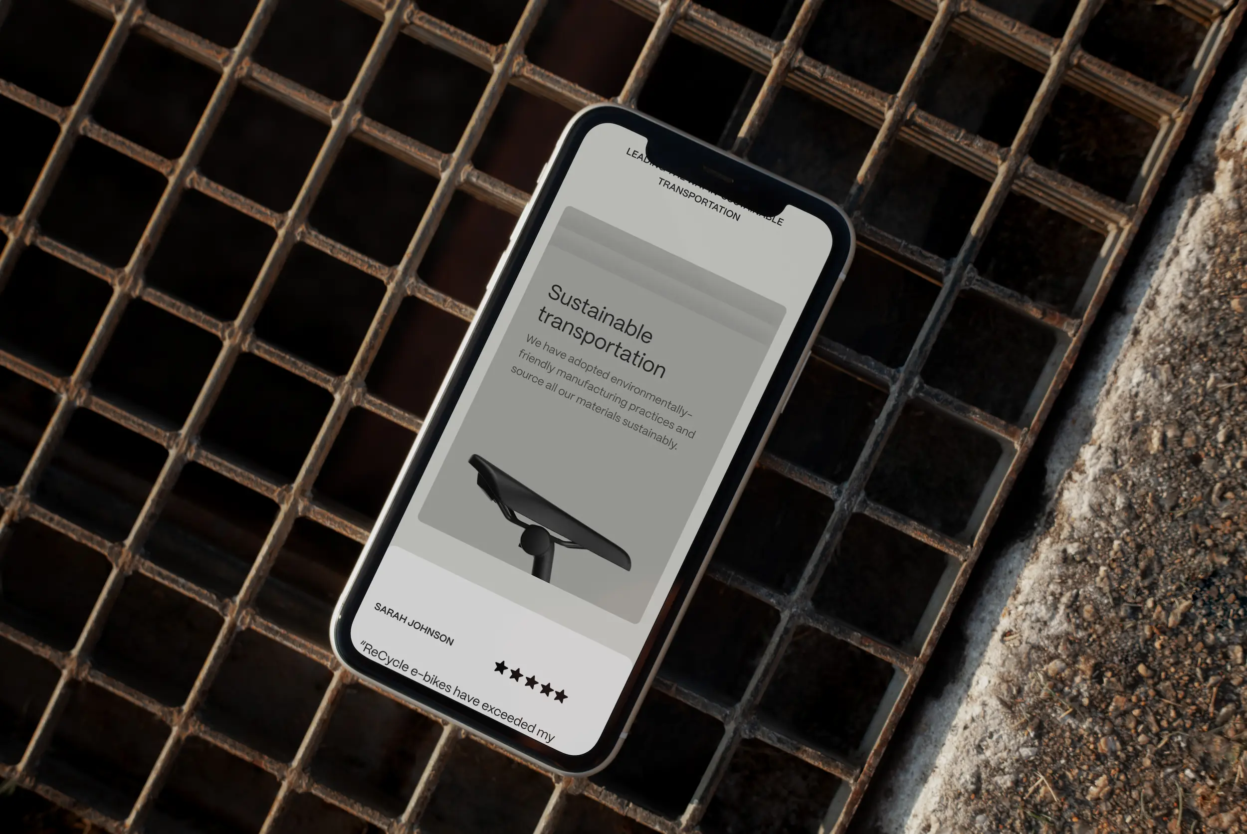
The visual language balances precision and warmth. Clean typography, generous spacing, and restrained color put the focus on frame lines, finishes, and key specs. Sustainability is present without preaching. Badges and short proof points show impact and certifications in plain language. Content moves from the feeling of the ride to the facts that matter, so visitors can admire the silhouette and still trust the numbers.
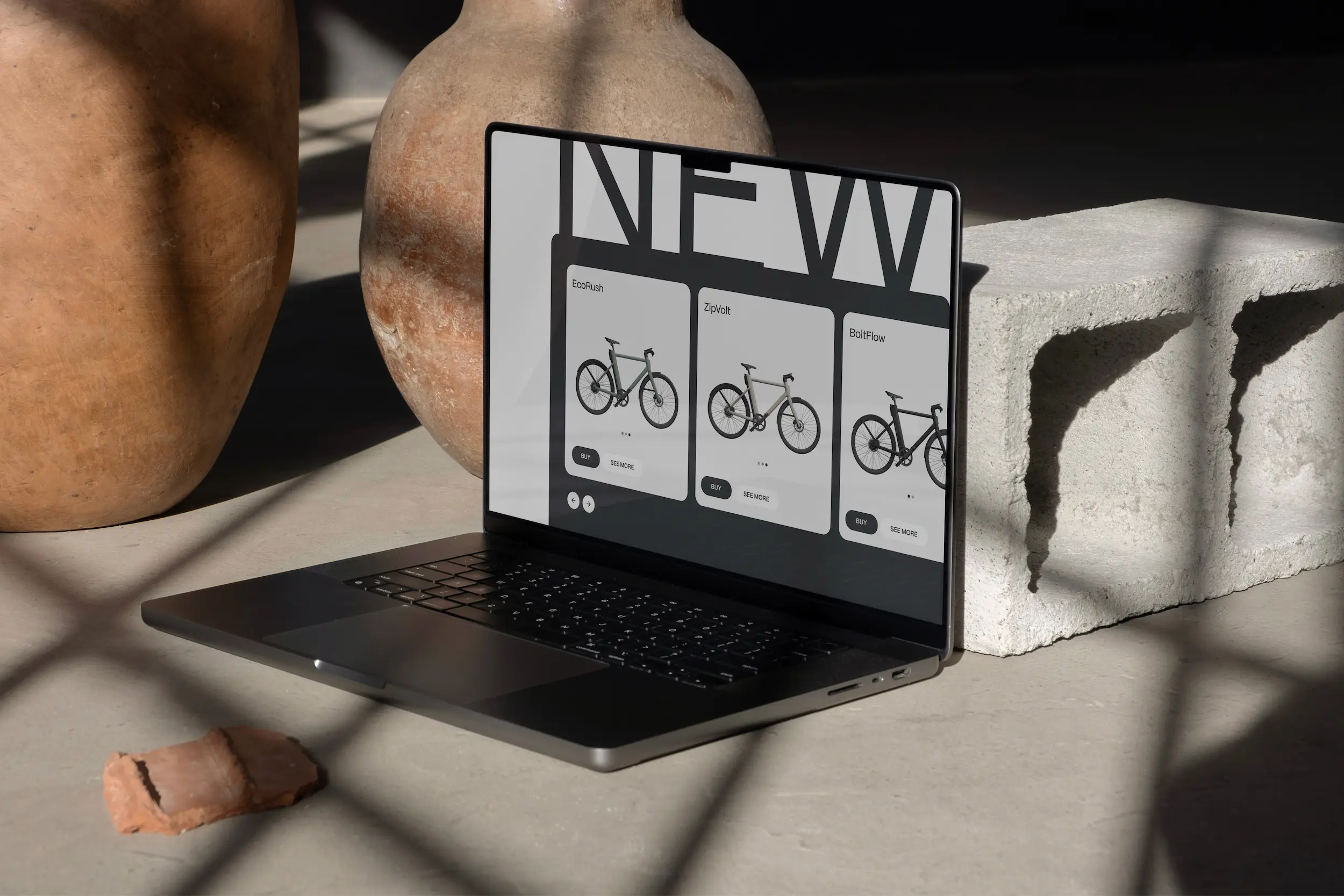
Navigation follows how people shop for bikes. You can start with style or with use case, then narrow by range, terrain, or accessories. Product pages make comparison easy with clear highlights, honest photography, and succinct explanations of features. Reviews and guarantees reinforce trust. The result is an experience that feels premium and approachable at the same time, built on familiar Relume patterns shaped to Re-cycle’s tone.


