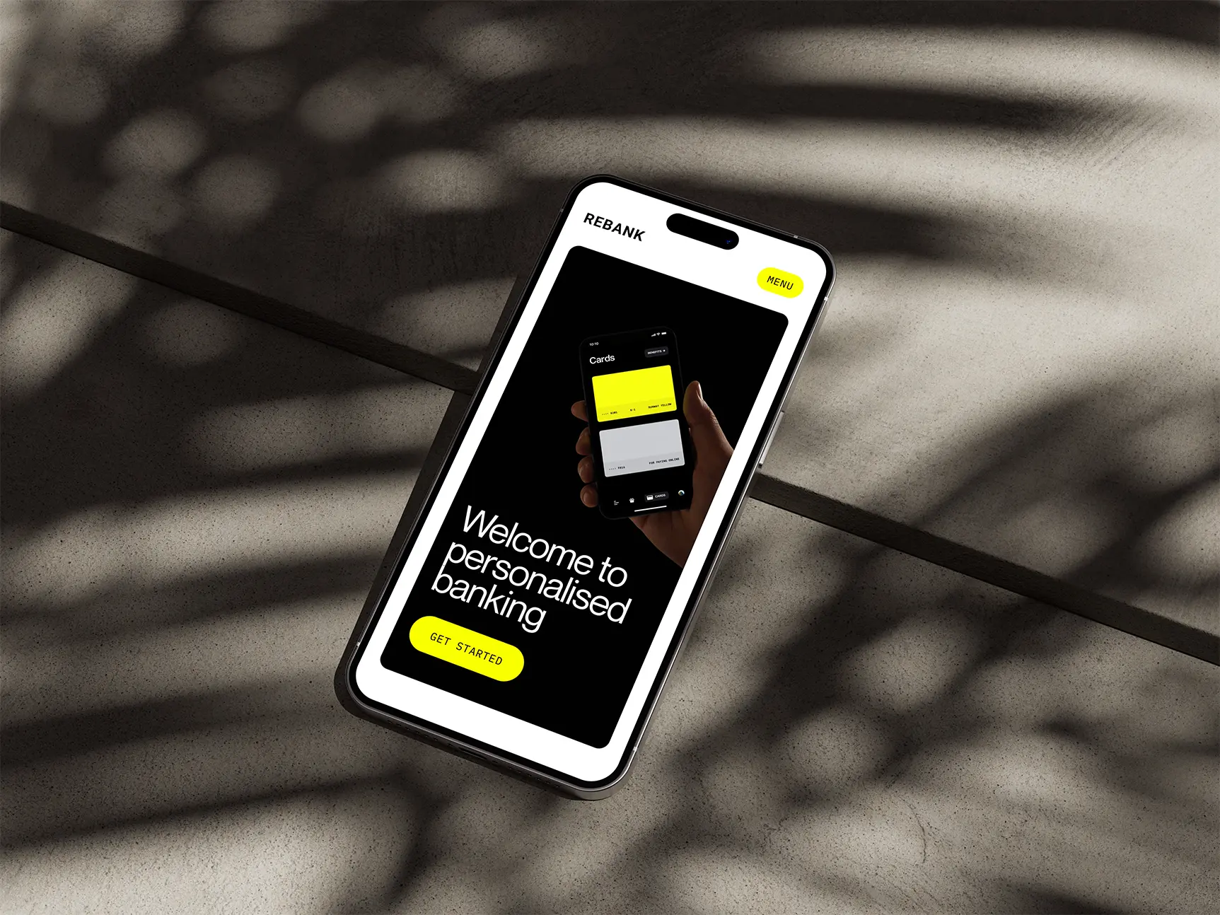
Looks modern, reads quickly, and stores trust in the details.

The project
The approach
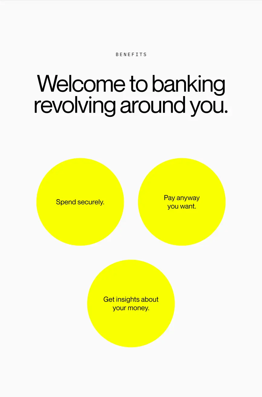
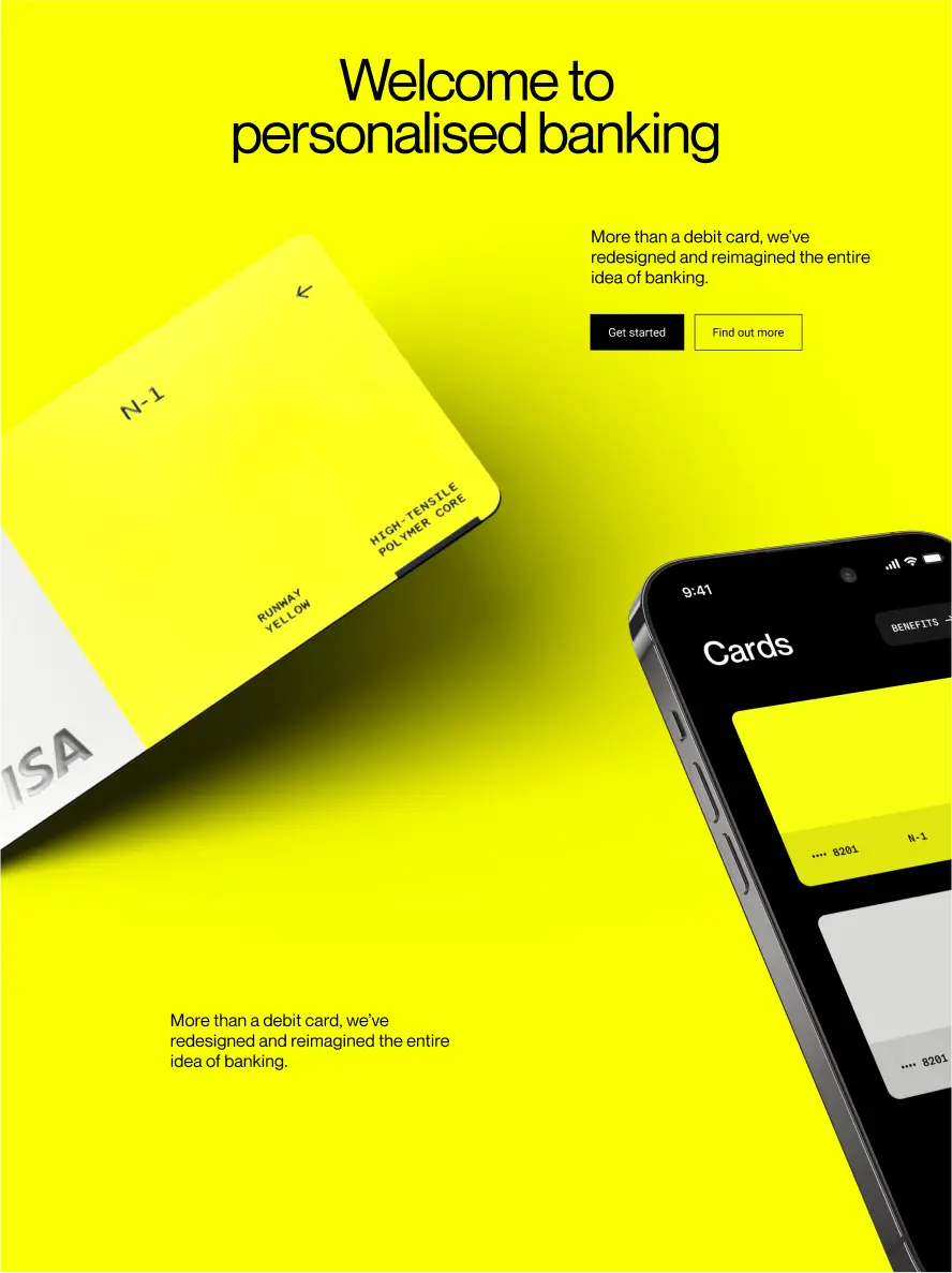
Rebank is a speculative B2B SaaS concept for small and medium businesses that want modern tools without the legacy feel. The identity leans into color as a strategic asset. Each card design informs a distinct palette that threads through channels, creating recognition without noise. The tone stays professional and calm while the visuals carry energy that signals a new kind of banking.
Color is broad but governed. The system supports light and dark themes with consistent meaning across both. Typography emphasises a restrained PP Neue Montreal to contrast the vibrancy of the palettes and bold imagery. While the brand system scales from site to product. Card inspired palettes drive collection pages, component accents, and empty states. Icons follow a shared grid and stroke logic so they hold up at small sizes.
The result is a vibrant yet credible presence. Looks modern, reads quickly, and stores trust in the details. Color communicates structure, not whim. Performance remains quick. Teams can move from intent to action with confidence while the identity stays memorable across every touchpoint.


