A living tradition for a new generation.

The project
The approach
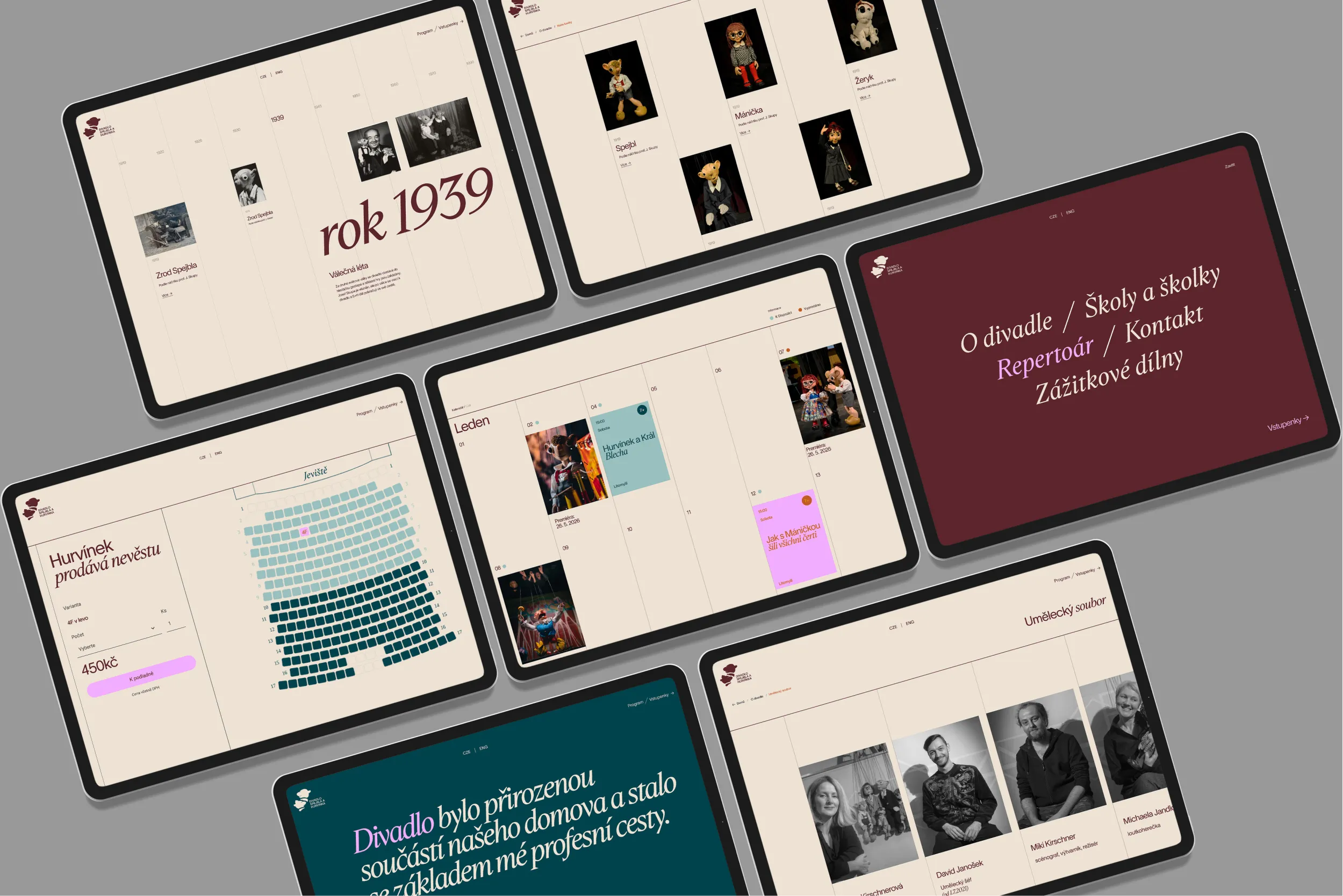
Spejbl a Hurvínek is a Prague institution with more than a hundred years of stories in carved wood. The brief was to protect that legacy and make it legible for today. The old logo carried affection but struggled in small sizes and digital use. Detail collapsed. Applications felt inconsistent. We needed a symbol that kept the soul of the characters and worked anywhere.
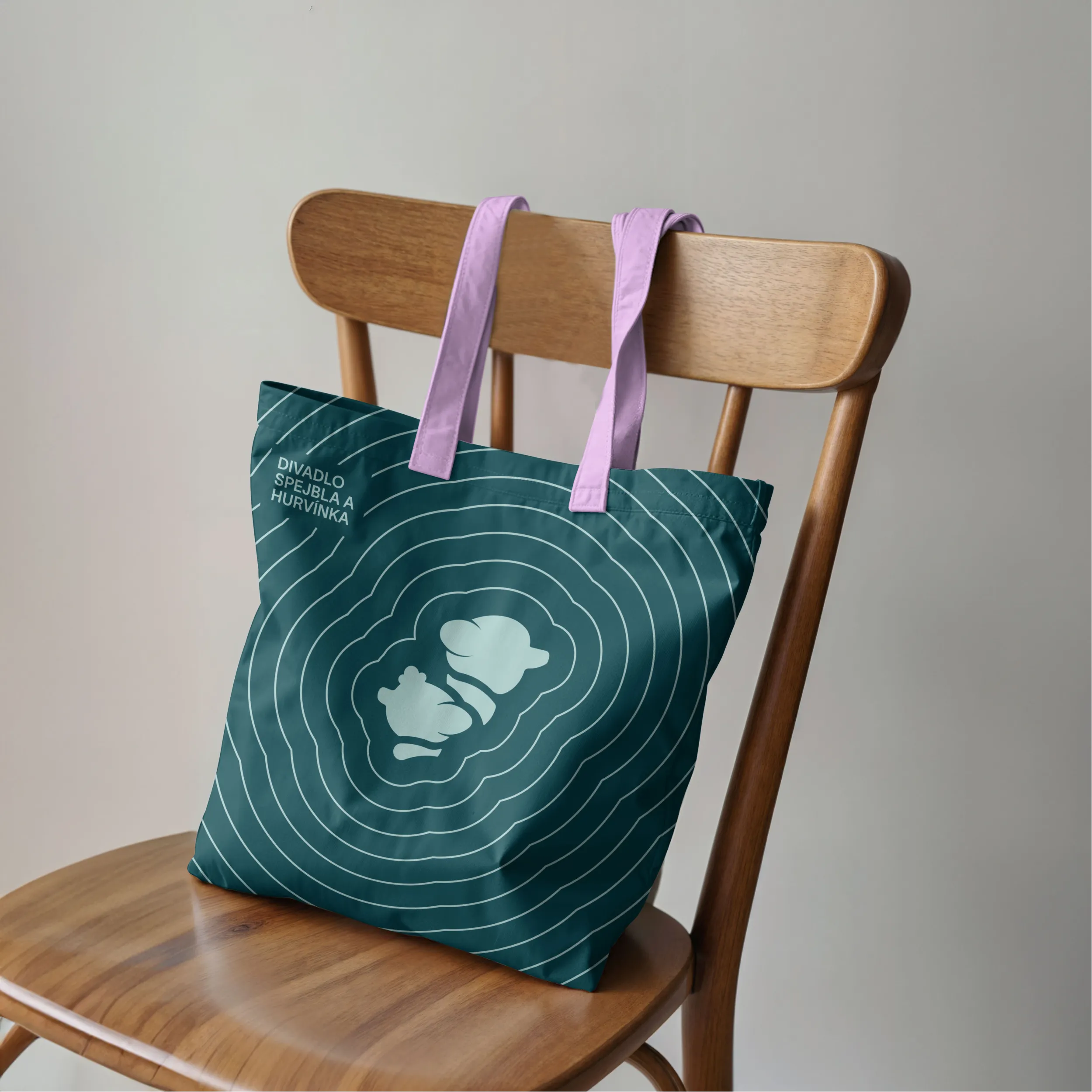
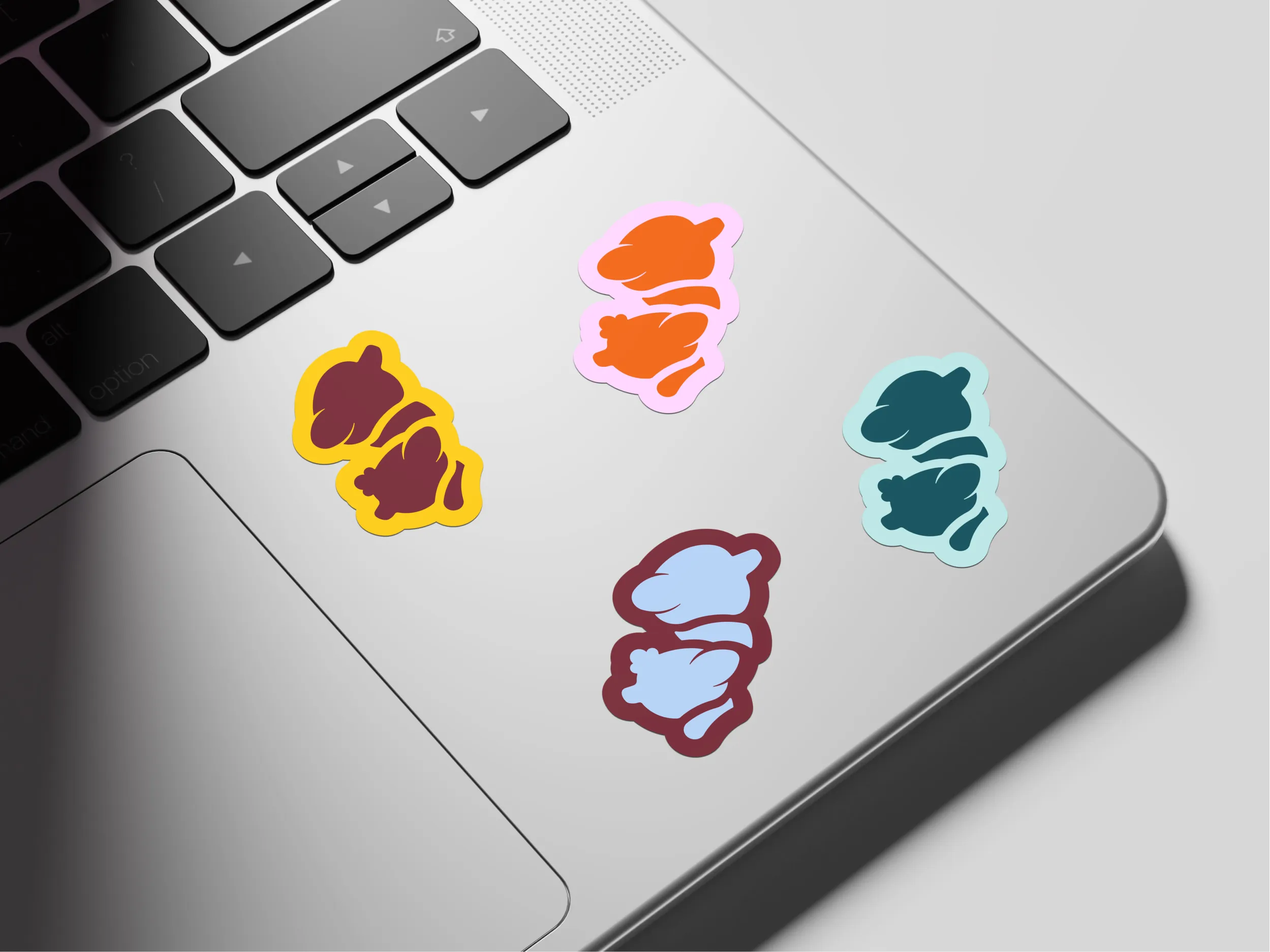
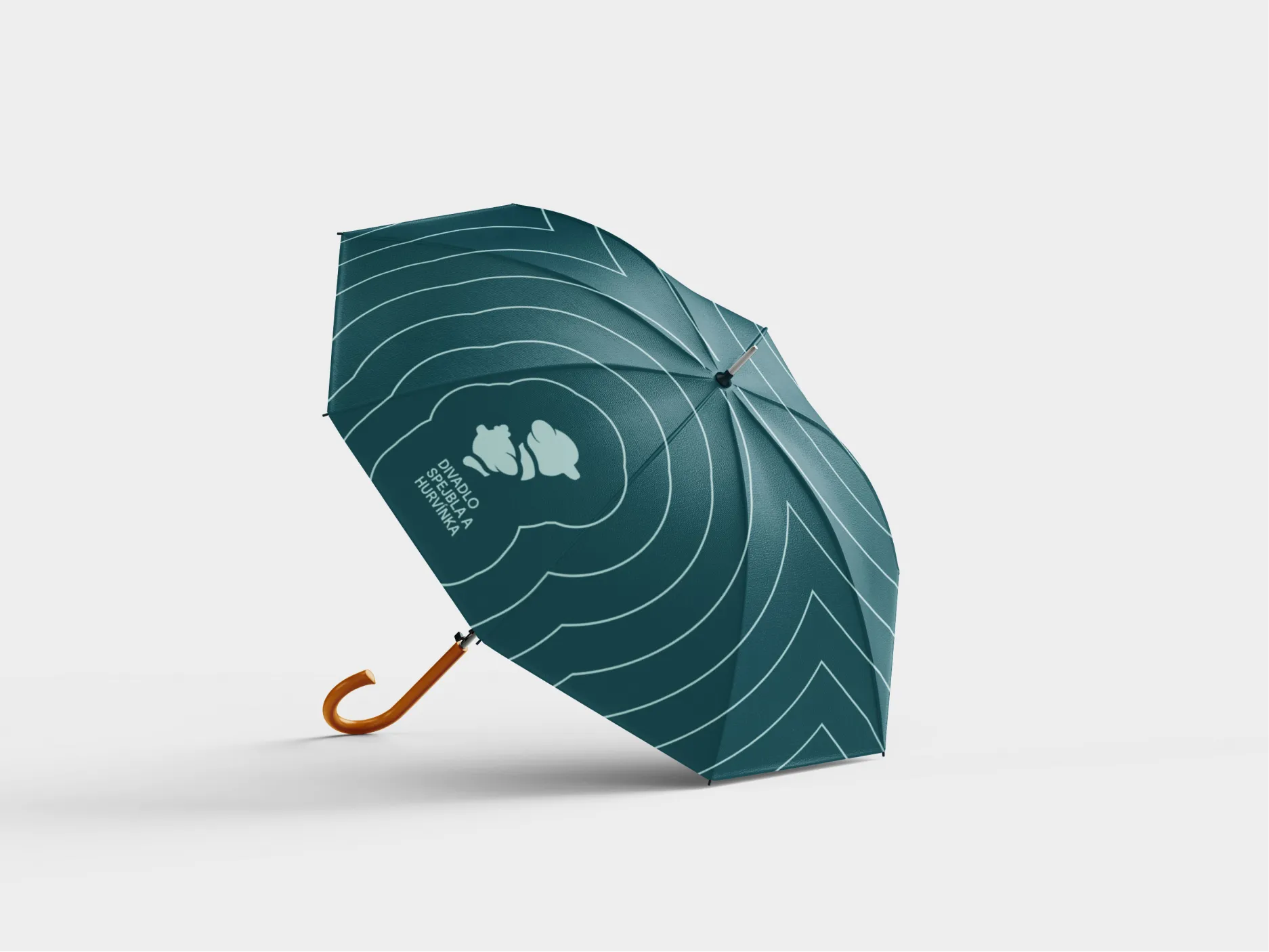
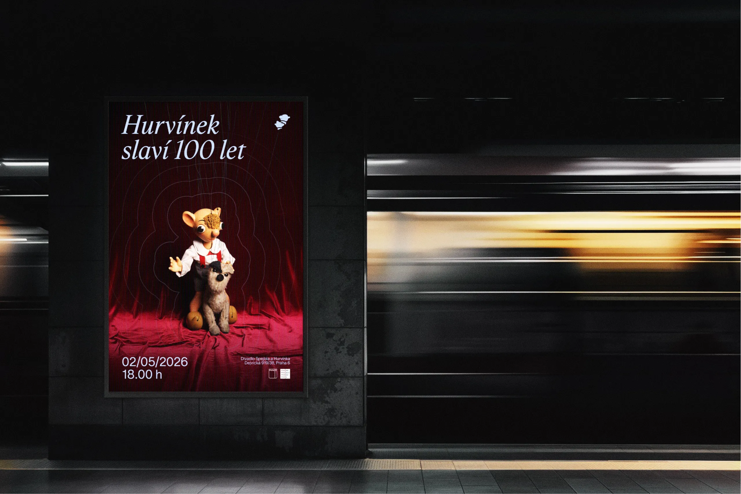
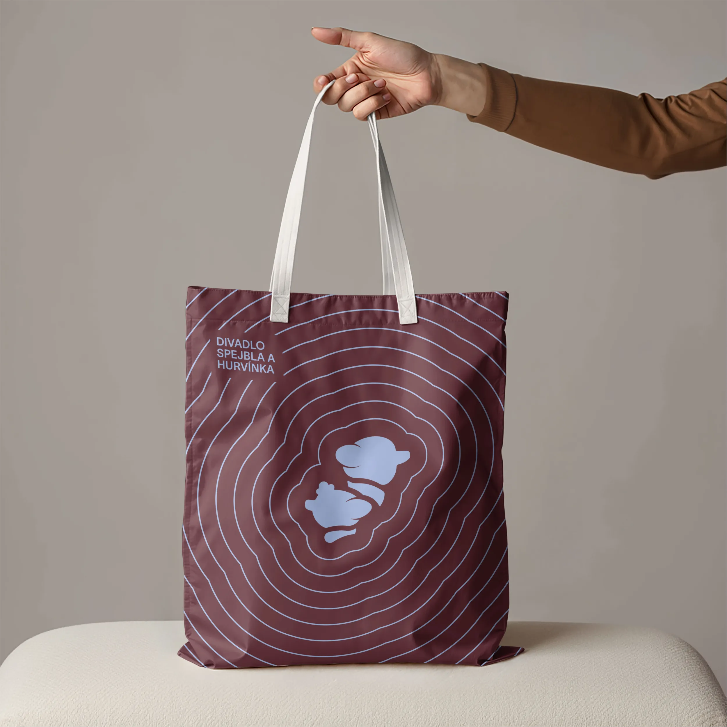
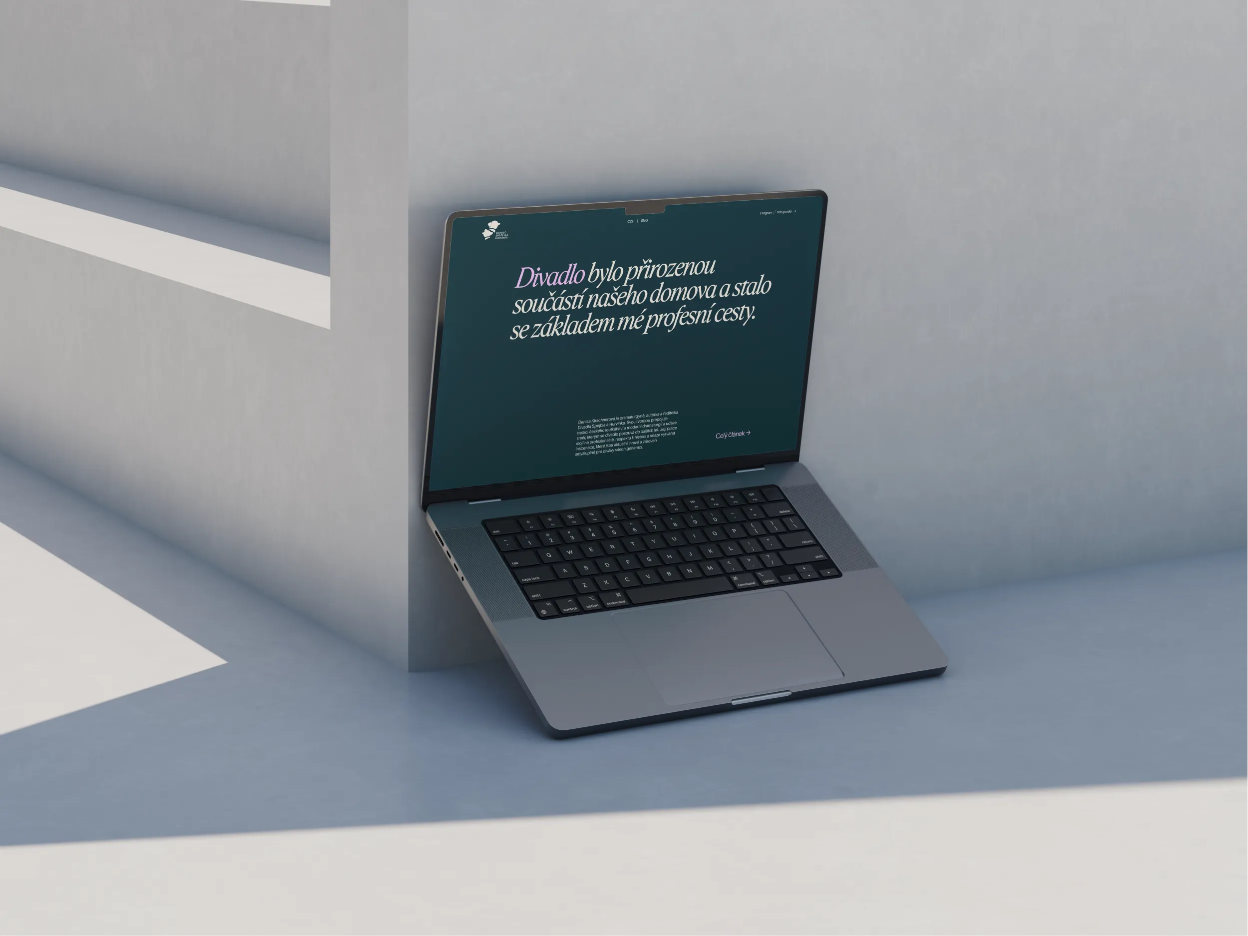
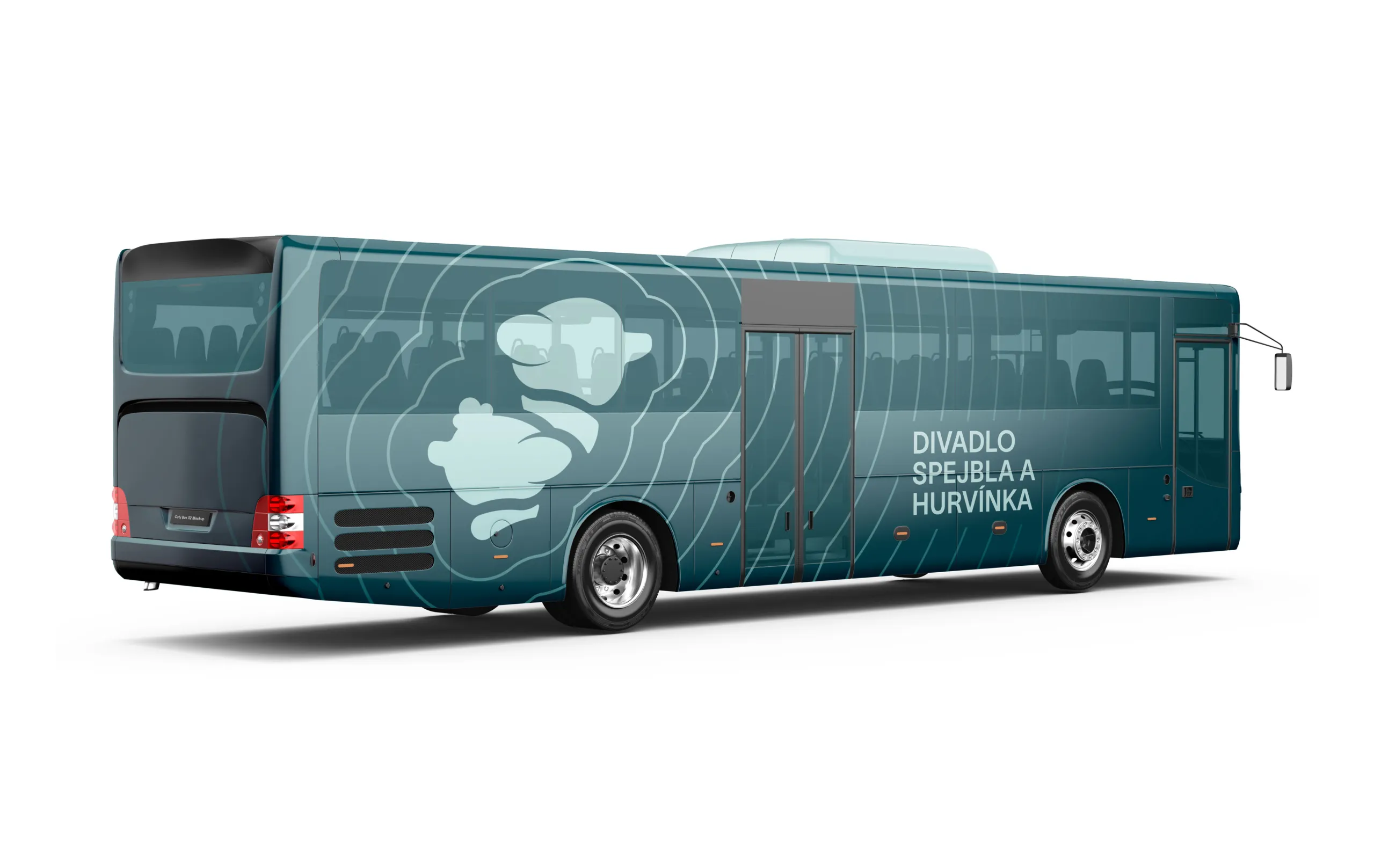
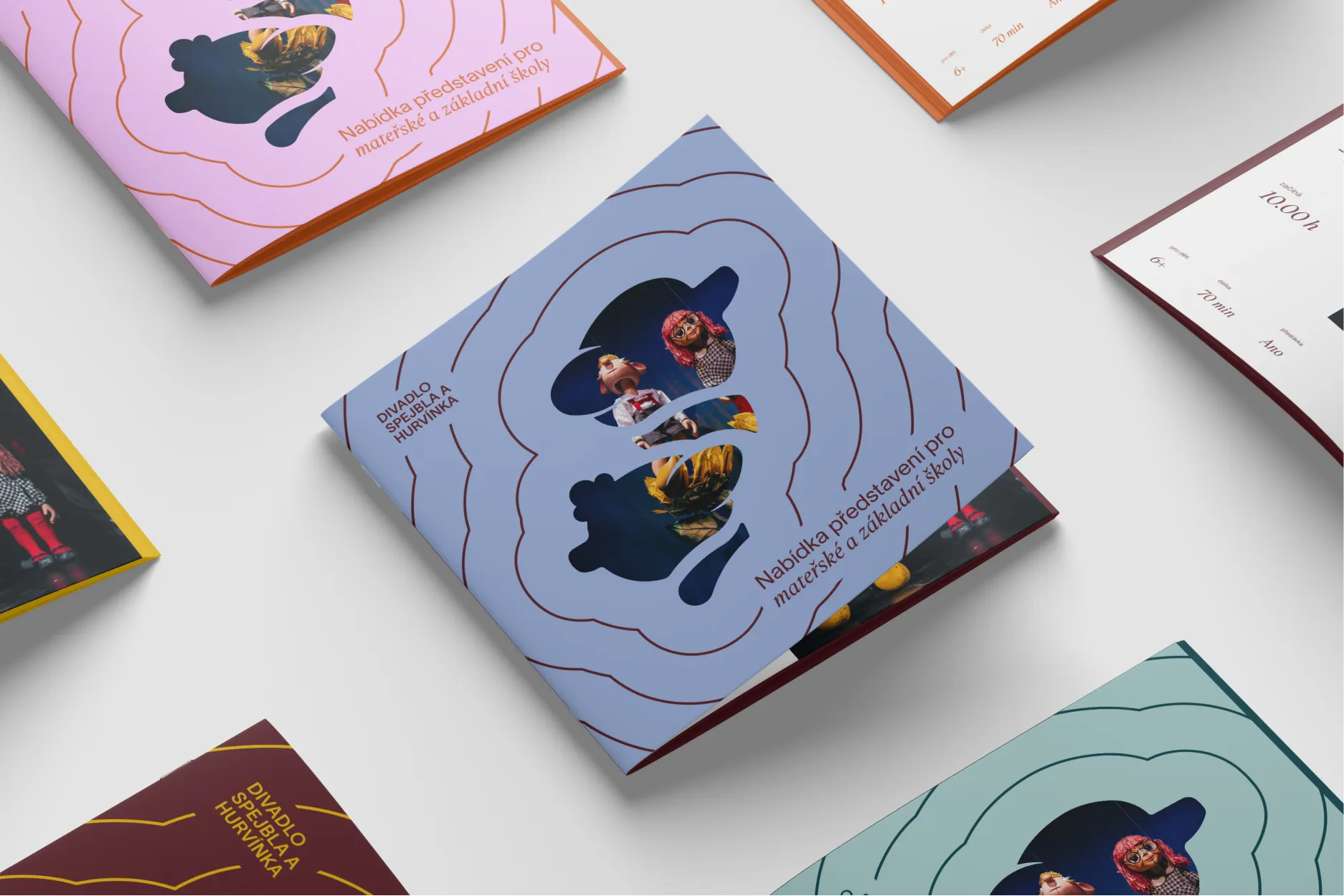
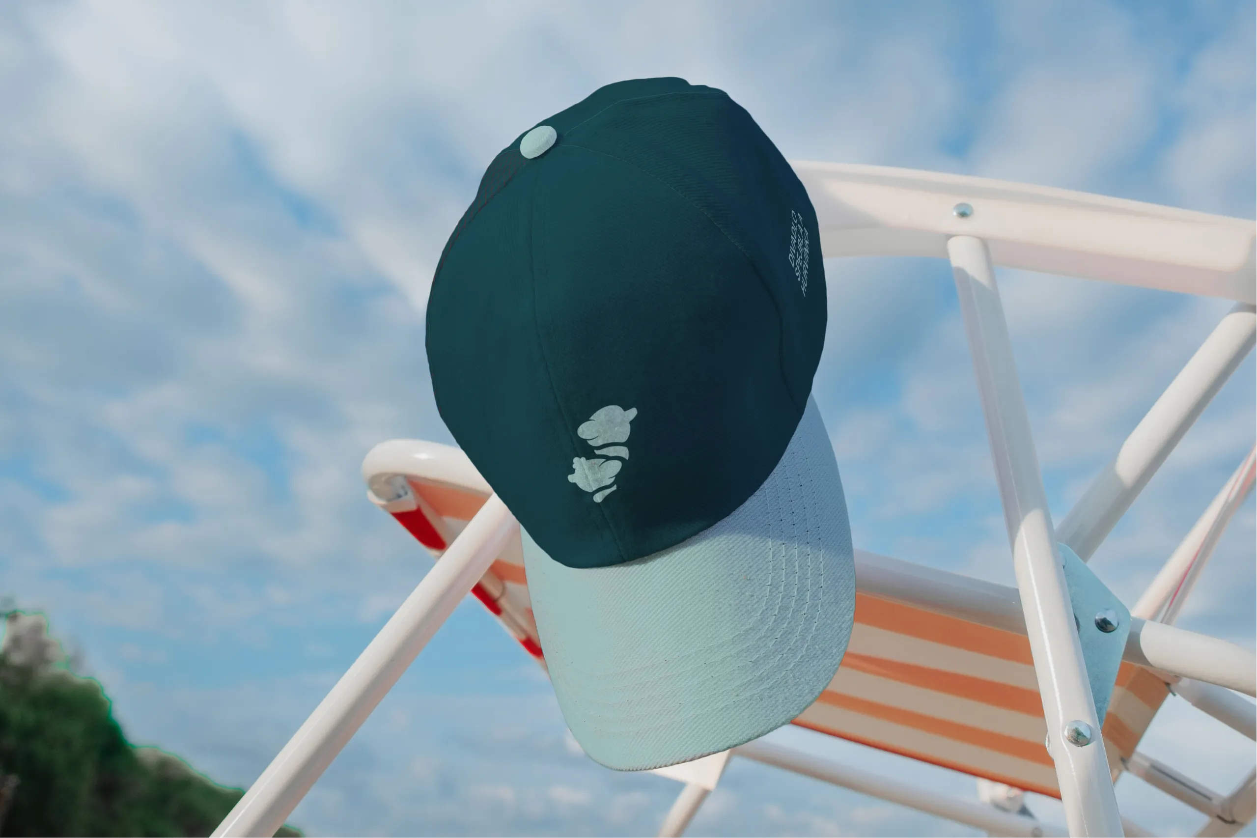
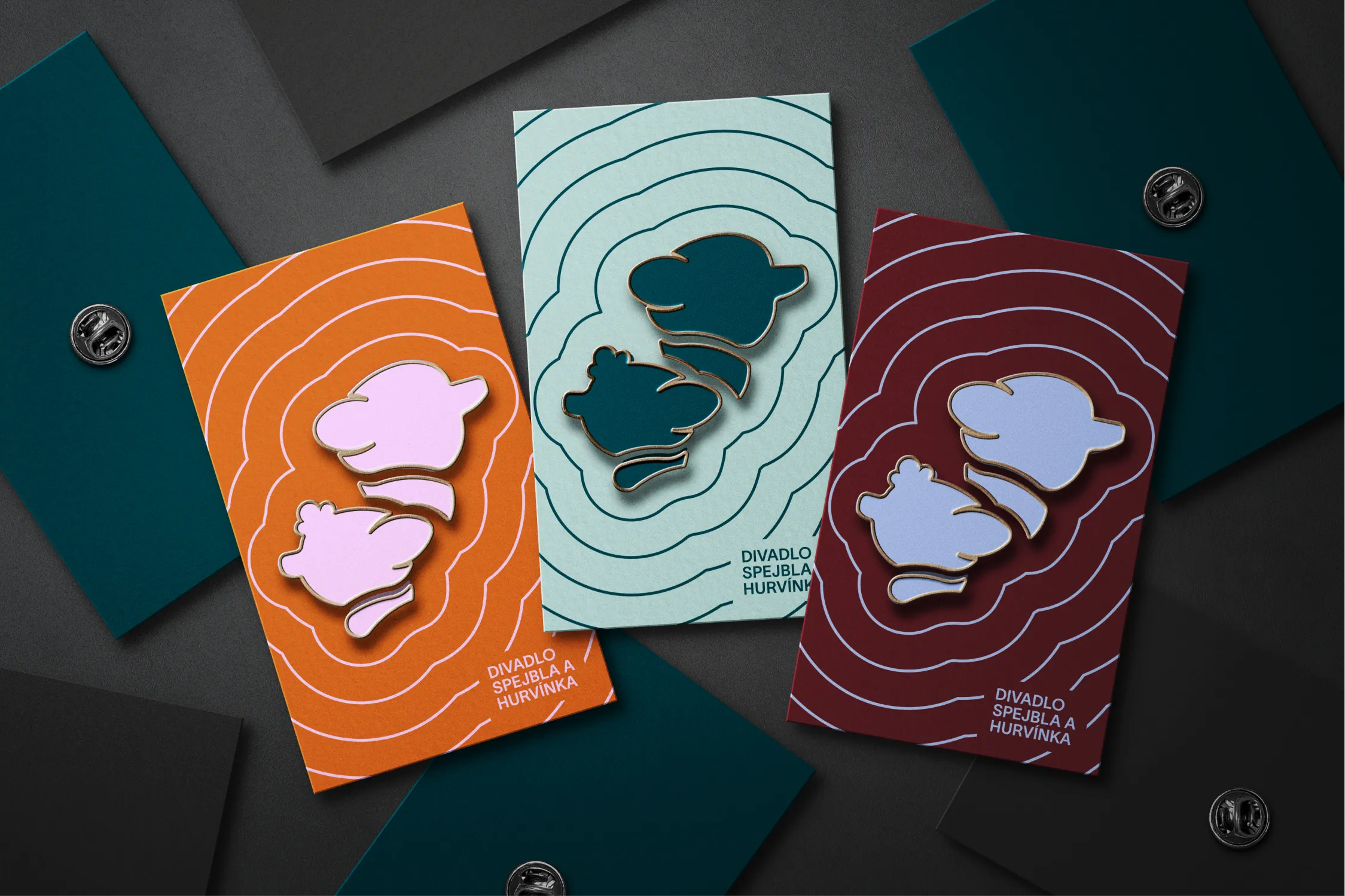
The new identity starts where the theatre begins: with the puppets. Spejbl and Hurvínek are preserved as simplified silhouettes, instantly recognizable and easy to read at every scale. Their forms anchor the system, appearing in locks for the logo, in framing devices, and as quiet watermarks across print and motion. Nothing is decorative for its own sake. Every use points back to the characters and the relationship audiences love.
Wood is a narrative thread. We treat it as the origin and promise. Textures and patterns reference grain in subtle ways.
Whimsy enters through proportion and pace. Strong accents and expressive lines appear in illustrations and simple animations. Shapes are slightly exaggerated to feel friendly rather than precious. The palette brightens in moments for children without losing clarity for adults. This keeps the experience inclusive, gentle, and unmistakably S+H.
Our submission for this open call project was recognised for its approach and promise, receiving 2nd place with highlights in the thoughtfulness and meticulous design approach.